Carefull.app
Creating a great product is the art
of combining strategy, emotion, and visual communication.
Carefull.app is an innovative mobile application that supports users in their daily health and safety routines. Its purpose is to simplify processes and provide an intuitive user experience in both mobile and web versions.

Project assumptions
Our goal was to design a product identity that would not only stand out, but also evoke trust among users of service applications focused on supporting and caring for the elderly. The process required detailed market analysis and a thorough understanding of the brand’s values, which we then transformed into a thoughtful visual message.
Process
The starting point was to design a logo, which was the foundation of their visual identity. Next, we focused on developing a mobile app, emphasizing intuitive UX and clear design that meet the expectations of today’s users.
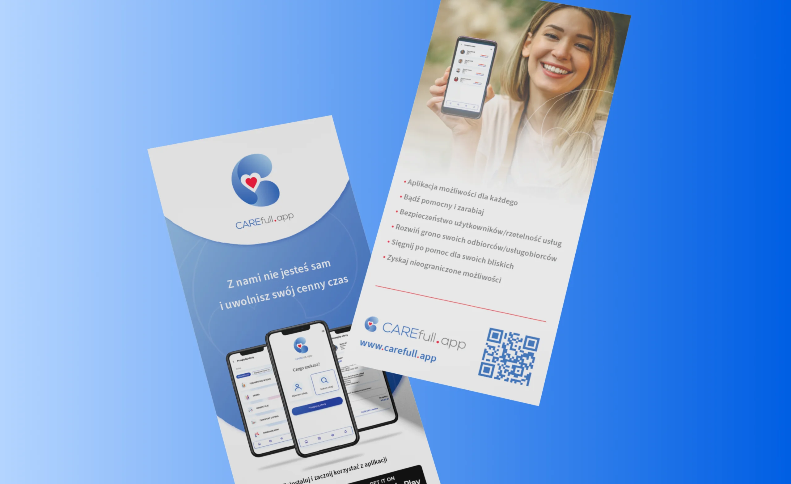
At the same time, we developed a website that coherently presented the app’s functionalities and highlighted the brand’s values. The whole thing was reinforced with printed materials (flyers, business cards) and consistent email footers that complemented communication at all key touchpoints.
Carefull.app received a comprehensive digital ecosystem—from the mobile application, which is the heart of the project, through the website, to the elements of identification and communication. As a result, the brand has gained a professional image, credibility, and tools to support its development in the technology market.
Analysis and research
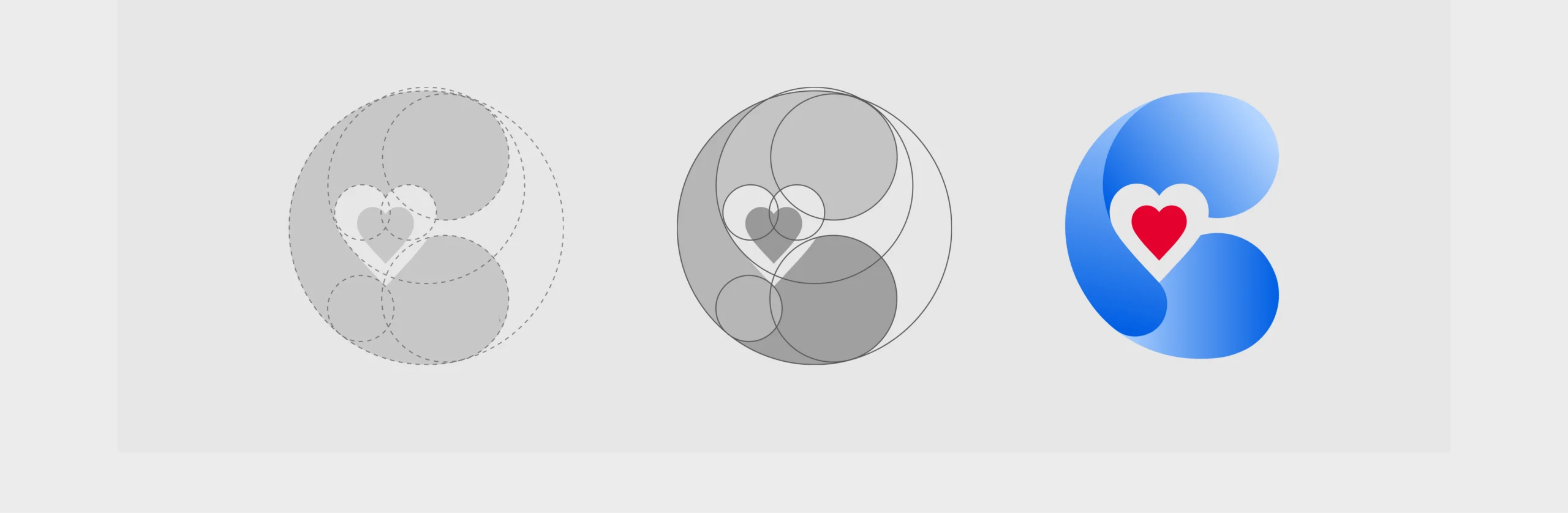
Logo proposals as the fundamental element of branding
Implementation
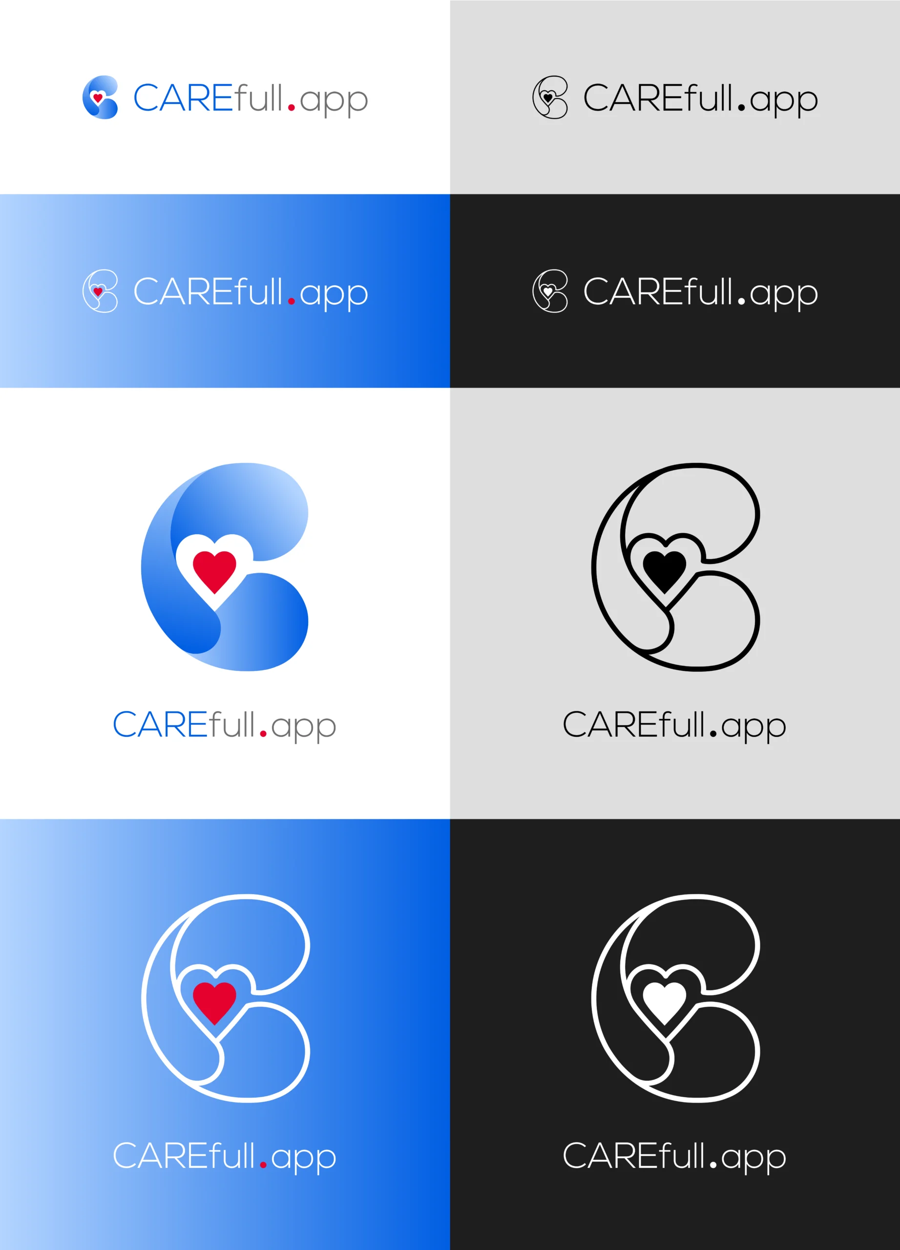
Integration across other areas of visual communication
Support, training, and consulting
1/ Logo design structure
Communication strategy
Carefull.app’s communication was designed to emphasize the proximity, security, and simplicity of using the mobile application. In this project, we focused on simple yet professional language that reflected the brand’s mission. This was to support everyday relationships and build engaged communities. Consistent visual and digital materials allowed Carefull.app to communicate in an authentic way, strengthening user trust and facilitating the company’s growth in the market.

2/ Colors palette
primary
secondary
white

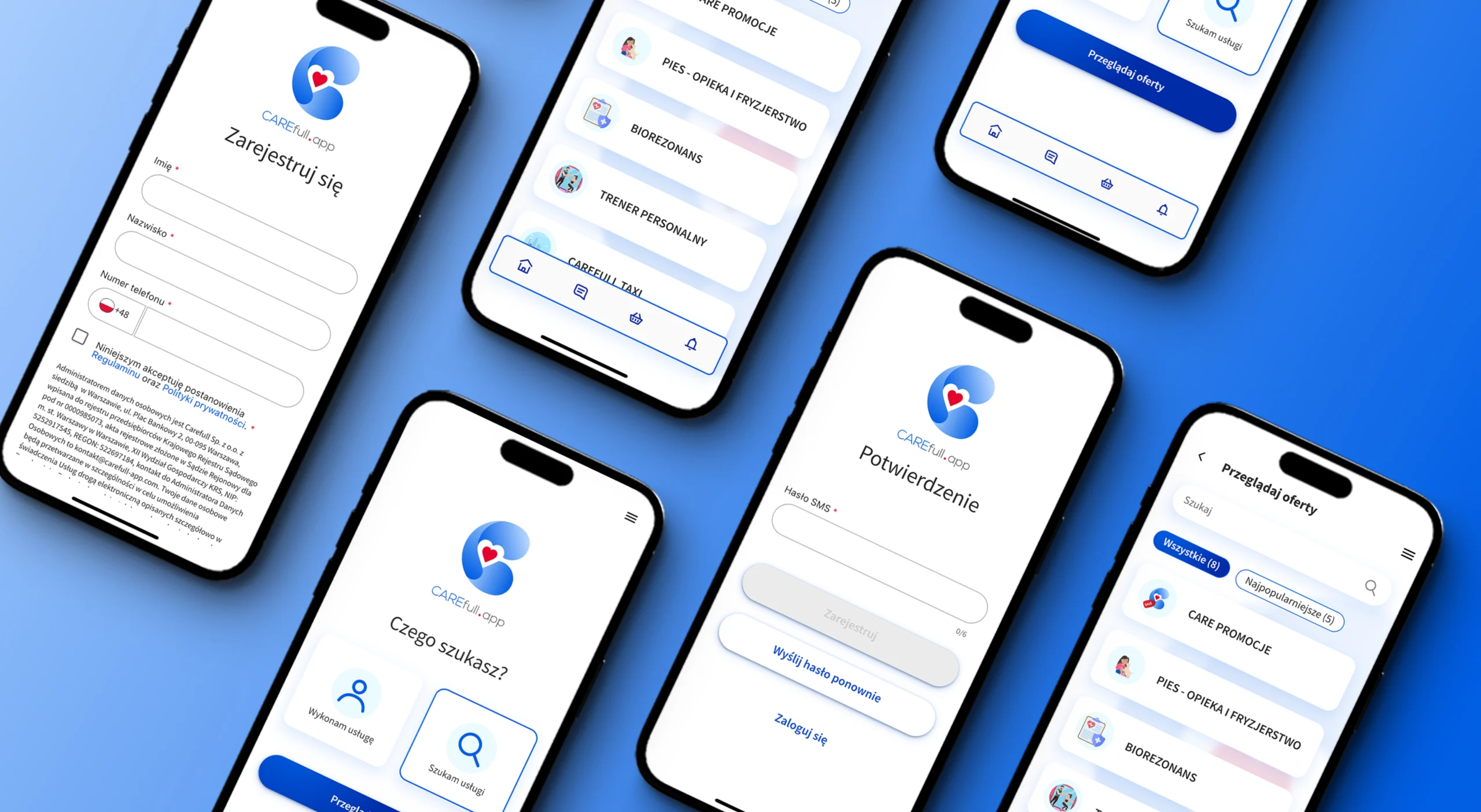
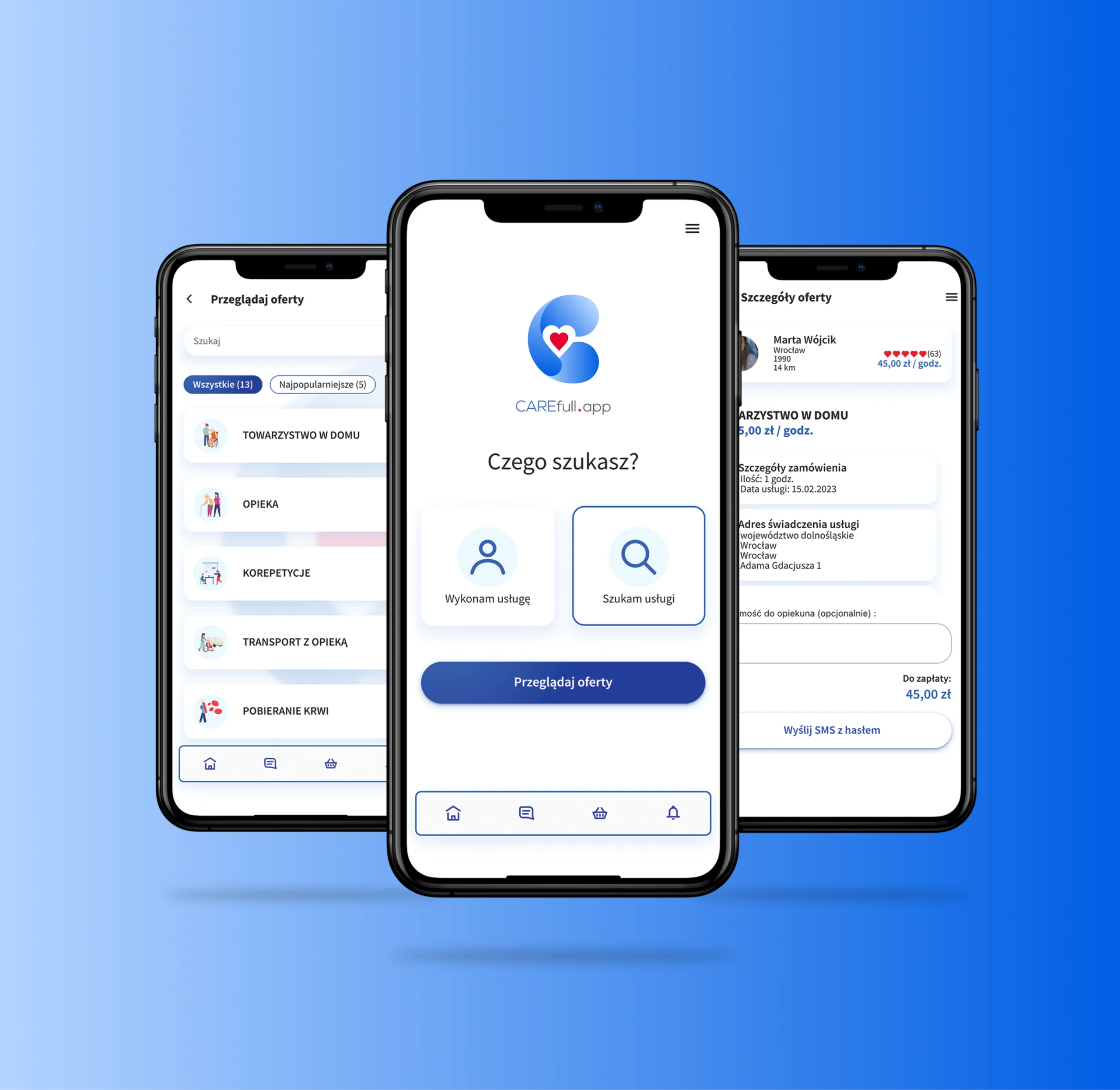
3/ Mobile application
The Carefull.app website and mobile application were designed as the central point of brand communication: simple, modern, and fully consistent with the visual identity. We ensured clarity of communication, intuitive navigation, and a transparent content layout that allowed users to quickly understand the app’s functions. We implemented comprehensible, user-friendly solutions that emphasized the convenience and innovation of the system. Every detail, from the color scheme to graphic elements, supported the professional image of the brand and emphasized its digital character. Thanks to this, Carefull.app has gained a platform that not only presents its services, but also effectively builds the company’s credibility.
A consistent, modern, and reliable product that radiates care and commitment to its users. We have combined intuitiveness and modern design to build a consistent image that sets Carefull.app apart from other digital solutions. This allows the brand to emphasize its role as a modern tool for mutual assistance and building local communities.
Let’s talk
Building a brand is a process. Let’s take the first step together.
Let’s create a brand that draws attention.